Uncovering Buried Treasure
Back when I was in art school, I had the chance to take a portrait painting class with a professor well known amongst the student body to be one of the hardest, yet most inspiring teachers. I loved listening to him talk about painting. He was absolutely passionate about it, and was one of those guys who would make you remember why you ever decided to go to art school in the first place. Unfortunately, due to the failure of many modern art schools, my skills (and many others’ in the class) were not yet advanced enough to get as much out of the course as we could have. Too many of us were still stumbling over ourselves, trying in vain to mix colors, not even understanding what a value scale was, etc. If you don’t believe that this can happen in art school just check out this video. It’s a complete travesty. You had to pray for good professors. Of course, at the time I was too young and stupid to see how poor some of my foundation classes were. C’est la vie…
Near the beginning of the course, our professor passed out some photocopies that had simple paint mixing formulas for flesh tones. The tones were divided into sets of lights, halftones, darks and neutrals. Add to this ivory black and titanium white and you had a nice formula for portrait painting. I tried to follow the charts in class and would eventually end up with something like “flesh” color, but I definitely couldn’t find a rhyme or reason to it that helped me out much. I used it more as a general guide to point me in the right direction. As I remember now, most of my paintings in that class were utter disasters.
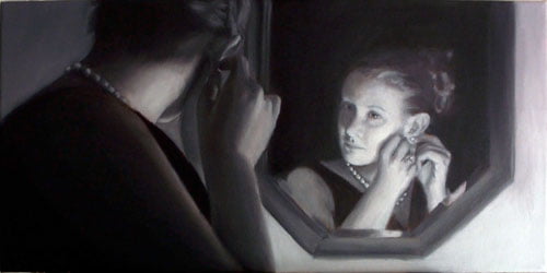
Anyway, I had the surprising forethought to pack that photocopy away among my art supplies and would re-discover it every now and then – usually every time I moved (which was quite a lot during the past decade). Upon moving into my new apartment, I again found it at the bottom of a storage tote and decided to leave it out for easy access since I had been slowly working on the oil painting of my wife. Since completing the grisaille underpainting, I had been reading everything I could find about oil painting trying to figure out how I was going to make the jump into adding color. In an effort to be so prepared that I wouldn’t possibly be able to screw it up, I ended up just making myself more nervous about it and nothing was getting done.
The Method to My Madness
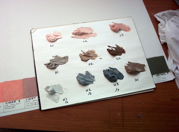
In one of the more “hardcore” oil painting forums that I frequent, I had read some discussion about the well-known portrait artist John Howard Sanden, and the method that he had developed for his students. On a trip to my local library I checked out a copy of his book Painting the Head in Oil. As I was flipping through the pages admiring his work, I suddenly had a very distinct feeling of déjà vu. There was the exact color mixing formula chart that my professor had given me back in college. As it turns out, the actual page from the book has a color chart printed next to the formulas to show you exactly what your mixture should look like. This was the missing piece of the puzzle and the reason that the use of these formulas had evaded me for so long. Sanden’s method, at its core, is very simple and practical, and with a little preparation beforehand, it sets you up to paint for long periods of time without having to stop and mix colors from scratch every few minutes. Being a strong proponent of practicality myself, I naturally decided that this was how I was going to approach the color portion of my painting.
Basically, the method consists of pre-mixing a range of 10 flesh tone values – 3 lights, 2 halftones, 2 darks and 3 neutrals – all of which can be mixed from a combination of standard colors that every serious oil painter should have in his/her repertoire:
- Cadmium Yellow Light
- Yellow Ochre
- Cadmium Red Light
- Venetian Red
- Cadmium Orange
- Burnt Sienna
- Alizarin Crimson
- Chromium Oxide Green
- Viridian
- Cerulean Blue
- Ultramarine Blue
- Ivory Black
- Your favorite white (preferably a Titanium blend or Flake White)
These are to be pre-mixed en masse so that you can simply start with the appropriate “local†flesh color and then modify it slightly as needed in your particular painting. This is an incredibly efficient method and the base colors work as a good starting point for all ethnicities and skin types. It takes a while to mix the initial colors, but the benefits of it more than justify the time investment. You’re going to want to mix large piles of each value so that they last a long time. In between sessions I put mine in a low, flat plastic container lined with wax paper and store it in the freezer (much to the chagrin of my wife).
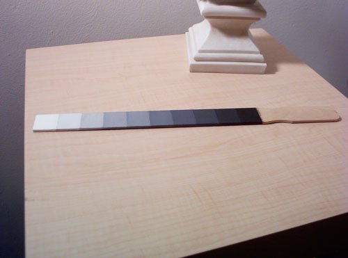
In addition to your 10 flesh values, the next best tool to have in your arsenal is a black-to-white value scale. I had come across this tip while researching the Munsell Color Matching System in the aforementioned “hardcore†artist’s forum. They recommend making a simple, but very effective tool – a value scale made from a paint stirring stick. Mixing a Munsell value scale is pretty intense and could have been a whole post in and of itself, but that story goes beyond the scope of this article. Suffice to say, it’s a challenge. Sanden also recommends a value scale and his book even has a basic one printed in it for easy reference, but this is hardly practical when you’re trying to work with oils. The paint-stirrer value scale is the perfect size and easy to hold up to your canvas to make comparisons as you paint. I highly recommend making one for yourself. Be warned, however, that it will take you at least an entire day… It’s much harder than it looks, especially if you aim to match the Munsell value scale, but the benefits are incredible!
Taking the Next Step
In my previous posts, I had made the assumption that I was going to use oil glazes over my grisaille underpainting and that, essentially, most of the original grisaille would show through. Through countless hours of reading, research, and online discussions with fellow artists, I began to understand that this is not how to properly paint using a grisaille. The point of the grisaille is to help you solve all of the value problems in the first step, and then use it as your guide for the subsequent steps, wherein opaque flesh tones are painted directly over the underpainting. At first I found this idea to be annoying. It seemed like all of the hard work and rendering that I did on the grisaille would be covered up and invisible when the painting is finished – so what’s the point? I found out, however, that the grisaille shows through in subtle, yet highly effective ways. Also, as I added color over top, it definitely didn’t feel like I was completely painting the scene over again. In other words, it didn’t take nearly as much time to paint as the original grisaille.
Step by Step
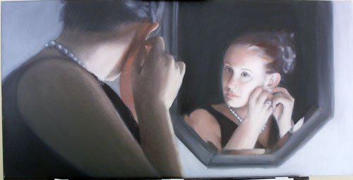
So here is how it played out in the current session. I began where I left off with my finished grisaille. The painting had been in storage for a few months, so I made sure to clean and dust the surface of the canvas before I began. I had my Sanden Method colors freshly mixed and in their own container. My primary palette is a 12″ x 18″ pane of glass (with duct tape around the edges for my safety) that I re-purposed from an old picture frame. I usually put a sheet of gray paper under it while painting in order to better judge color relationships. On this I had small piles of the above listed colors laid out around the edge.
The basic working method is to pick the area that I want to paint (I started with the darkest flesh tones) and decide which Sanden color is the closest starting point. I put some of this color on my palette. Next, I have to decide what colors to mix with my base color in order to accurately match my reference photo (this is where those mad skills come in…). But I also have to be concerned that I’m matching the value correctly. Values between the palette and the canvas can be deceiving. A color can look like a very close match on the palette, but when you dab a brush stroke on the canvas you’re shocked at how much lighter it is. Enter the Munsell value scale.
All I have to do is hold up the value scale to the area of the grisaille that I want to paint over and find what the relative value is. I then compare that gray value to the color I’m mixing on the palette until they match perfectly (squinting helps you to see the value of the color better while comparing it to the Munsell scale). Then, when I was satisfied with the color mix, I began lightly covering over the area on the canvas. I was thrilled at how using this method sped up the process and helped me to match my values accurately the first time, rather than noodling around for a while trying to guess at it.
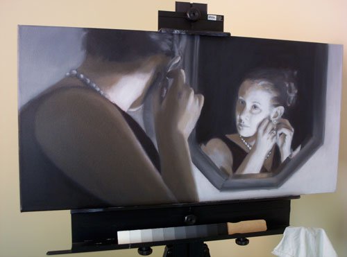
My plan of attack was to do all of the flesh tones first, and then use glazes in a more proper way – mostly on the background of the picture. My wife has a lovely auburn hair color, so I think I will lay some opaque brown paint down first and then glaze some warm reds over it to capture the hue. But for now, I began by working from the darkest flesh tones to the lightest. As I mentioned earlier, I was surprised how much the grisaille actually does still show through, and it truly served as a helpful guide in handling the color. I felt free to totally explore my color choices, rather than get bogged down in modeling form, and within a few hours I had finished the basic lay-in of the flesh tones.
I did notice that by the end of this painting session I had slightly lost a bit of my wife’s likeness, so I’ll need to go back in and fix that next time. Overall, though, I am absolutely thrilled with the outcome of this session. This is by far the best painting I’ve done so far, and I’m already making notes of things that I’ll do differently next time. There is no better teacher than practice and hard work. Until next time…
To be continued…
