A Commission with a Twist…
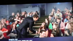
You know, sometimes life throws us some delightfully unexpected turns… Take, for instance, the current project I’m working on… Recently, a colleague of mine was sharing with me about her daughter Kirsten’s love of the late night TV host (and former Saturday Night Live notable) Jimmy Fallon. She had taken her daughter to New York to attend a taping of his show, where her wildest dream came true – Jimmy came up into the audience after the show, shook her hand and then hugged her. Needless to say, it made Kirsten’s day, month, year, and quite possibly decade!
Her mom had seen some of my Photoshop work and wondered about the possibility of having an image produced with her daughter and Jimmy together in a montage (a birthday gift for a Jimmy super-fan!). After thinking about it for a while, I suggested a dual-portrait with some sort of clever composition that would give her daughter exactly what she wanted, but also go easy on the cheese-factor. (I do have my pride, after all…) In return, she would have a hand-rendered piece of fine art that could be cherished for generations and would: a) make Kirsten happy because she had a picture of herself and Jimmy; b) make her mother happy because it will be a beautiful portrait of her daughter that doesn’t scream “I’m stalking Jimmy Fallon”; and c) make the artist (me) happy because I would get to practice my craft, and with a great family, and Kirsten – a very beautiful, funny, and quick-witted subject. Oh, and did I mention that I would actually get paid??? Who would have thought you could make money in the art business?!
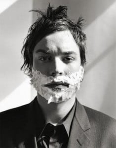
Kirsten obliged me by posing for portrait photographs and then sharing some of her favorite photos of Jimmy. We arrived at what she confessed was her all-time favorite photo of him, which was promptly selected for inclusion in the dual-portrait. Now far be it from me to impugn the thinking of a 15 year-old girl, but I had to chuckle at the photo she chose. In said photo, Jimmy stares at the camera with a blank expression, hair unkempt, his face lathered with shaving cream. He looks as if he has just rolled out of bed after a late-night bender (he’s still wearing a suit) and is having his morning shave… It’s the look that so many of us guys have in the morning – staring at ourselves in the mirror, trying to collect our thoughts and shake the sleep out of our head enough so that we feel safe scraping a razor blade across our face… This is not a moment we would normally consider a “photo-op”… Although, Jimmy seems to have that charm and baby-face appearance that so many of us guys do not possess. It could well have been a photo of him waking up in a pool of his own vomit, and still the young girls would gush over him…
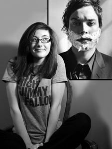
But enough ranting… I went home and immediately began working on a composition. Photoshop is a great time-saving ally in finding the perfect composition for my work, and I always try to follow the old-school rules of how to arrange the picture plane, even though I’m utilizing modern technology. After I’ve gotten a rough mock-up finished, I e-mail it to the client for approval before I begin working. Kirsten and her mom both loved it and immediately gave me approval to move forward. Did I mention how much I like these clients???
Rolling Up the Sleeves
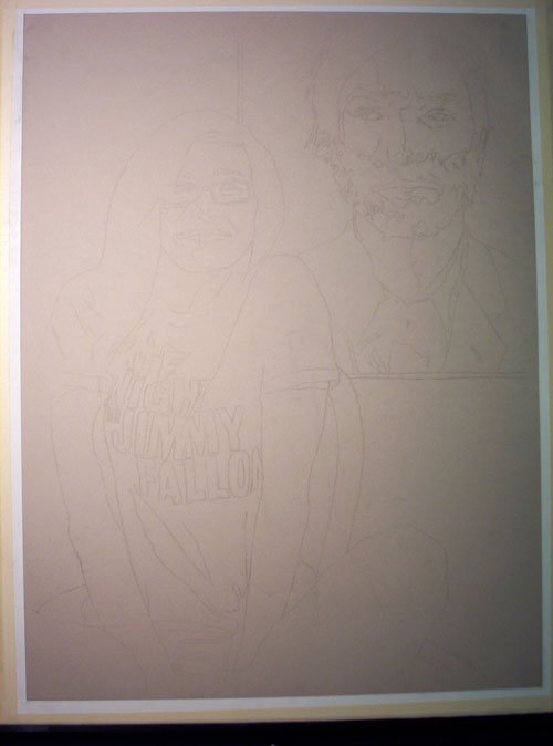
As I begin the portrait, I follow the method I described ad nauseum in my post on the drawing of the Indonesian children. My final drawing will be 18″ x 24″, so I again use a Dürer grid to help me transfer a line drawing of my composition onto a full-size sheet of vellum. This drawing will be rather tricky for a couple of reasons: a) it’s a dual portrait (I’m a glutton for punishment); b) if you study the composition photo closely, you’ll see that the drawing is to depict Kirsten sitting in front of a poster-sized image of Jimmy… Since the drawing is to depict a three-dimensional subject (Kirsten) sitting in front of a two-dimensional photograph (Jimmy) it will call for careful attentiveness to the value-range of charcoal I use for each. I don’t necessarily want this to come across as a trompe l’oeil, wherein Jimmy appears ready to jump out of the drawing and yell “LIVE FROM NEW YORK… IT’S SATURDAY NIGHT!!!” That said, I’m thinking that a smaller range of values will be more appropriate to “flatten” the image of Jimmy against the wall behind Kirsten. This will be equally tricky with vine charcoal, since it already has a more limited value range than compressed charcoal or oil paint (did I mention that I’m a glutton for punishment?)… Ah well, all the better to challenge myself with things that nobody will ever notice but me…
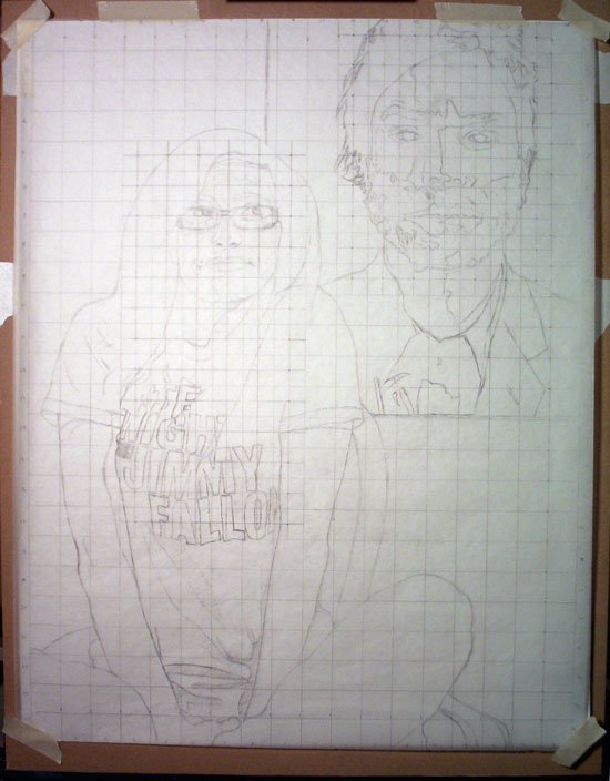
After my line drawing is complete, I again make use of my charcoal shavings from earlier drawings by dumping some out on the back-side of my line drawing, rubbing it around with a paper towel, and then using it to transfer my line drawing onto the final paper. For this piece, I’ve selected a brownish-gray sheet of heavy 19″ x 25″ Canson Mi-Tientes. The only other charcoal paper I’ve experimented with thus far is Strathmore. It’s not bad, but I like the heavier thickness of the Mi-Tientes, and I also think it makes for a nicer presentation to the client.
Now the drawing is transferred and I’m ready to begin the actual rendering. Better get the kettle on…
To be continued…